DIGITAL PHOTOGRAPHY & IMAGING - WEEK 11
Week 11(9/6/22)
Student: Tai Ser Yeet (0345798)
Programme:
Bachelor of Design (Honours) in Creative Media
Task: Project 2B-
Digital Imaging Exercise Part 2
LECTURE
Fig 1.1 Lecture Slides, Week 11 (9/6/22)
PRACTICAL
For this week's practical class, Mr. Martin taught us the ways to
animate in Adobe Photoshop. Below are the few exercises we
did:
SUPERGIRL

Fig 1.2 Mask Girl from Background, Week 11 (9/6/22)

Fig 1.3 Remove Girl from Background, Week 11 (9/6/22)

Fig 1.4 Convert Girl to Smart Object, Week 11 (9/6/22)

Fig 1.5 Making the Girl Fly,
Week 11 (9/6/22)

Fig 1.6 Adding KeyFrames, Week 11 (9/6/22)
FINAL GIF (SUPERGIRL)

Fig 1.7 Final GIF of Supergirl, Week 11 (9/6/22)
GIRL WITH CAT

Fig 2.1 Duplicating Image, Week 11 (9/6/22)

Fig 2.2 Removing Girl From Background, Week 11 (9/6/22)

Fig 2.3 Masking out Foreground (Grass), Week 11 (9/6/22)

Fig 2.4 Erasing the Residue of Foreground To Obtain
Background, Week 11 (9/6/22)

Fig 2.5 Separated Different Grounds, Week 11 (9/6/22)
After obtaining the different grounds, animation was applied to
the following.
FINAL GIF (GIRL WITH CAT)

Fig 2.6 Final GIF of Girl With Cat, Week 11 (9/6/22)
YOGA GIRL

Fig 3.1 Removing Girl From Background, Week 11 (9/6/22)

Fig 3.2 Animating Yoga Girl, Week 11 (9/6/22)
FINAL GIF (YOGA GIRL)

Fig 3.3 Final GIF of Yoga Girl, Week 11 (9/6/22)
|
|
| Fig 1.4 Convert Girl to Smart Object, Week 11 (9/6/22) |
|
|
| Fig 1.5 Making the Girl Fly, Week 11 (9/6/22) |
|
|
| Fig 1.6 Adding KeyFrames, Week 11 (9/6/22) |
|
|
|
|
|
|
|
|
|
|
|
|
|
|
|
|
|
|
|
|
|
|
|
Fig 2.5 Separated Different Grounds, Week 11 (9/6/22) |
|
|
|
|
|
|
|
|
|
|
|
Fig 3.2 Animating Yoga Girl, Week 11 (9/6/22) |
|
|
|
Fig 3.3 Final GIF of Yoga Girl, Week 11 (9/6/22) |
INSTRUCTIONS
Fig 4.1 Instructions For Final Project, Week 11 (9/6/22)
FINAL PROJECT - POSTER DESIGN
ATTEMPT #1
RESEARCH
RESEARCH
For this task, Mr.Martin instructed us to first write a brief
self-introduction followed by our passion, motivation, and
visualization of our artwork. Below are the screenshots from the
template given:

Fig 4.1.2 Biography Questions, Week 11 (9/6/22)

Fig 4.1.3 Statements About Poster, Week 11 (9/6/22)
While I was brainstorming ideas on how to create a very unique
composition whilst also incorporating the art of surrealism, a
brilliant idea popped into my head and it was a poster with an
over-shoulder shot of myself looking at my reflection in the
mirror. I thought it was pretty different as typically seniors
from BDCM merely mask them from the front view. Not to mention
that most of the outcomes were cheerful and vibrant whereas mine
would very much be contrasting.
INSPIRATION
|
|
| Fig 4.1.2 Biography Questions, Week 11 (9/6/22) |
|
|
|
Fig 4.1.3 Statements About Poster, Week 11 (9/6/22) |
As stated in the answers above, I wanted my poster to be
based on a horror theme therefore blood will definitely be
present. Generally, the flow of the animation would be
starting off with a colorful image of myself looking at the
mirror in the foreground whereas my reflection would be
looking at the camera in the background. After that, the
mirror would begin to glitch. During that moment, my facial
expression would change to a poker face and dark red blood
would roll down both cheeks. To incorporate more red into the
poster, the quote is written on the mirror using red lipstick,
similar to Fig XX.
1. Angles
Here are some over-the-shoulder shots of individuals staring at
their reflection in the mirror. Also, I particularly aim to
replicate Fig XX just because the lighting was how I envisioned
it which makes it more suiting for a reference picture. Besides
that, it is also a horror-themed photograph.

Fig 4.1.4 Reference Image 1, Week 11 (9/6/22)(Source: Mearaj, n.d.)
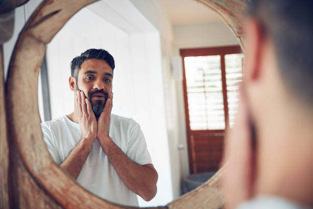
Fig 4.1.5 Reference Image 2, Week 11 (9/6/22)
If I had a cracked piece of glass, I could pursue this specific
composition but I do not therefore I would have to compromise by
utilizing my vanity mirror.
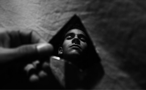
Fig 4.1.6 Reference Image 3, Week 11 (9/6/22)(Source: Unsplash)
2. Text & Motion
I would like for the blood to flow down similar to the movie
poster (See Fig XX).

Fig 4.1.7 Reference Image 4, Week 11 (9/6/22)(Source: Netflix, 2019)
As for the chosen quote, the spray can effect combined with the
choice of red is what I imagined having on my surreal
poster.

Fig 4.1.8 Reference Image 5, Week 11 (9/6/22)(Source: Netflix)
3. Surrealism Posters/ Senior's Works
Fig 4.1.9 Compilation of Senior's Works, Week 11 (9/6/22)

Fig 4.2 My Favorite Senior's Works, Week 11
(9/6/22)(Source: Mr.Fauzi)
SKETCHES
My idea describes a girl that looks cheerful and innocent on
the exterior but when you get to know her for long, she
eventually turns into an odd and creepy individual.

Fig 4.2.2 Sketch 1 & Sketch 2, Week 11
(9/6/22)
PHOTOSHOOT SESSION

Fig 4.2.3 Over-The-Shoulder Shot, Week 11
(9/6/22)
DIGITALISATION ON PHOTOSHOP
I began by importing my images into Photoshop and started
masking out necessary areas according to my sketches.

Fig 4.2.4 Removing the Wall, Week 11 (9/6/22)

Fig 4.2.5 Removing Reflection of Myself In the
Mirror, Week 11 (9/6/22)
In Fig XX, I masked out my reflections for both pictures so
that I was able to switch the mood from a happy-go-lucky moment
to a more serious and creepy tone.
|
|
| Fig 4.1.4 Reference Image 1, Week 11 (9/6/22)(Source: Mearaj, n.d.) |
|
|
| Fig 4.1.5 Reference Image 2, Week 11 (9/6/22) |
|
|
|
Fig 4.1.6 Reference Image 3, Week 11 (9/6/22)(Source: Unsplash) |
|
|
|
Fig 4.1.7 Reference Image 4, Week 11 (9/6/22)(Source: Netflix, 2019) |

|
|
Fig 4.1.8 Reference Image 5, Week 11 (9/6/22)(Source: Netflix) |
|
|
| Fig 4.2 My Favorite Senior's Works, Week 11 (9/6/22)(Source: Mr.Fauzi) |
|
|
|
Fig 4.2.2 Sketch 1 & Sketch 2, Week 11
(9/6/22) |
|
Fig 4.2.3 Over-The-Shoulder Shot, Week 11
(9/6/22) |
|
Fig 4.2.4 Removing the Wall, Week 11 (9/6/22) |
|
Fig 4.2.5 Removing Reflection of Myself In the
Mirror, Week 11 (9/6/22) |

Fig 4.2.6 Masking Out My Reflection, Week 11
(9/6/22)
|
Fig 4.2.6 Masking Out My Reflection, Week 11
(9/6/22) |
FEEDBACK
Mr. Martin told me that the entire concept of my idea was not
a poster and requested to rethink it again. Furthermore, the
reference images I found in regard to my inspiration also did
not meet the requirements of a poster. However, he liked the
theme behind my design though.
I was disappointed because I knew that I needed to restart
the whole process once more which would be time-consuming.
Nevertheless, I never gave up and proceeded with Attempt
2.
WEEK 12
ATTEMPT #2
RESEARCH
RESEARCH

Fig 4.3 Biography Questions, Week 12 (16/6/22)

Fig 4.3.2 Statements About Poster, Week 12 (16/6/22)
INSPIRATION
SURREALISTIC POSTERS
I particularly lean towards the idea of having a book as
a portal to the Harry Potter world so I found references
that were similar to that.

Fig 4.3.3 Reference Images For Surrealistic
Poster, Week 12 (16/6/22)(Source: Pinterest)
POSTER DESIGN

Fig 4.3.4 Reference Images For Poster
Design, Week 12 (16/6/22)(Source: Pinterest)
SKETCHES

Fig 4.3.5 Sketch 1 & Sketch 2, Week 12 (16/6/22)
|
Fig 4.3 Biography Questions, Week 12 (16/6/22) |
|
|
|
|
|
|
|
Fig 4.3.4 Reference Images For Poster
Design, Week 12 (16/6/22)(Source: Pinterest) |
| Fig 4.3.5 Sketch 1 & Sketch 2, Week 12 (16/6/22) |
PHOTOSHOOT SESSION
I took 3 different sets of photos with head-turning in opposite
directions to represent the feeling of curiosity.

Fig 4.3.6 A Shot of Myself Walking With Back Facing
Camera, Week 12 (16/6/22)
DIGITALISATION ON PHOTOSHOP
1. Compiling Images
To start off, I began compiling images that fit the theme of
my choice. Below are the reference pictures I used to create my
posters.

Fig 4.3.7 Images for the
StoryBook, Week 12 (16/6/22)

Fig 4.3.8 Images for the Pathway, Week 12 (16/6/22)

Fig 4.3.9 Images of Dragons, Week 12 (16/6/22)

Fig 4.4 Images Harry Potter
Characters, Week 12 (16/6/22)

Fig 4.4.2 Images for Background, Week 12 (16/6/22)

Fig 4.4.3 Hogwarts' Castle, Week 12 (16/6/22)
| Fig 4.3.6 A Shot of Myself Walking With Back Facing Camera, Week 12 (16/6/22) |
|
|
|
|
|
|
|
|
| Fig 4.3.9 Images of Dragons, Week 12 (16/6/22) |
| Fig 4.4 Images Harry Potter Characters, Week 12 (16/6/22) |
| Fig 4.4.2 Images for Background, Week 12 (16/6/22) |
| Fig 4.4.3 Hogwarts' Castle, Week 12 (16/6/22) |

|
|
|

|
|
|

|
|
Fig 4.4.6 Masking Background Me, Week 12 (16/6/22) |
|
|
|
Fig 4.4.7 Masking Mid-Ground Me, Week 12 (16/6/22) |

|
| Fig 4.4.8 Masking Hogwarts' Castle, Week 12 (16/6/22) |

|
| Fig 4.4.9 Masking Dragons & Wizards On Broomsticks, Week 12 (16/6/22) |

|
|
Fig 4.5 Creating a Pre-Layout, Week 12 (16/6/22) |

|
|
Fig 4.5.2 Making A Portal In Storybook, Week 12 (16/6/22) |

|
| Fig 4.5.3 Adding the Dragons, Week 12 (16/6/22) |

|
|
Fig 4.5.4 Warping the Stone Pavement Onto the
Road, Week 12 (16/6/22) |

|
|
Fig 4.5.5 Experimenting with Different Color of
Skies, Week 12 (16/6/22) |

|
|
Fig 4.5.6 Warping Storybook Page Onto
Blank Page, Week 12 (16/6/22) |

|
|
Fig 4.5.7 Adding Fog, Week 12 (16/6/22) |

|
| Fig 4.5.8 Changing Color of My Dress, Week 12 (16/6/22) |

|
| Fig 4.5.9 Masking Out the Grass & Placing On My Poster, Week 12 (16/6/22) |

|
| Fig 4.6 Changing Color of My Dress, Week 12 (16/6/22) |

|
|
Fig 4.6.2 Color-Coordinating the Layers &
Pre-Compositing, Week 13 (23/6/22) |

|
| Fig 4.6.3 Animating the Flying Wizards, Week 13 (23/6/22) |

|
|
Fig 4.6.4 Animating Clouds & Fog, Week 13
(23/6/22) |
|
Fig 4.6.5 Progressional Video, Week 13 (23/6/22) |

|
|
|

|
|
|

|
|
|

|
|
|

|
|
|

|
|
|
FINAL SUBMISSION OF POSTER DESIGN
Fig 4.8 Final Submission of Poster Design, Week 14 (30/6/22)
FINAL SUBMISSION OF ANIMATED POSTER DESIGN
Fig 4.8.2 Final Submission of Animated Poster Design, Week 14 (30/6/22) |
FEEDBACK
 | |
|
First off, Mr. Martin suggested decreasing the sharpness of the red dragon by 0.05 and desaturating the color of the dragon. As for the animation, the dragon flapping its wings and tilting its head in a subtle manner is ideal. There must be shadows for the 3 clones of myself to make the design more believable. Also, I should decrease the contrast for the image of myself in the mid-ground. The animation for Harry Potter's entourage was too much. Instead, just make all of them float in mid-air. Lastly, he wants us to add an adjustment layer to the poster design.


Comments
Post a Comment