DESIGN PRINCIPLES- VISUAL ANALYSIS & FINAL BLOG

Week 1 (4/1/22) - Week 7 (17/2/22)
Student: Tai Ser Yeet (0345798)
Programme:
Bachelor of Design (Honours) in Creative Media
Task: FINAL
PROJECT- VISUAL ANALYSIS
Jumplinks :
LECTURES
Week 6 (8/2/22 & 10/2/22) / Briefing on Final Project
- an ability that allows people to analyze and understand images critically
- develop a greater understanding of how a design's formal characteristics express ideas, substance, or meaning
PHASE 1: OBSERVATION
- Observation is carefully examining and identifying the visual features of a design, as well as attempting to describe them in your own words.
- Refrain yourself from conducting any research about the design beforehand.
- Looking, thinking, and choosing an effective language to convey what you notice are all part of the observation phase.
PHASE 2: ANALYZING
- Study your previous observations and form statements about the work based on the gathered evidence.
- Consider how the distinct visual aspects you've identified co-exists as a whole. On top of that, recognize the impact which that whole has on the viewer.
- Ask yourself, "What grabs your attention to the art and why? Utilize Design Principles that you have learned in the analysis.
- Research facts & data about the historical piece as well as the background of the chosen artists
- While conducting your exploration, there are two criteria to keep in mind. And that is the exact meaning behind that artwork & the purpose of it being created.
INSTRUCTIONS

I have decided to go with this particular painting of The Coronation of King Edward VII by Laurits Regner Tuxen. First off, deducing from the style of clothing, exquisite regalia, and painted venue, a 19th-century royal ceremony was captured. The first figure that caught my attention was the long, bright red cloak with gold accents worn by a middle-aged man. He seems to be leading the ceremony as everybody's eyes are drawn to the piece of white document, he was raising up high. Not only that, in comparison to the other spectators, his cloak clearly differs from the rest. Besides that, he happens to be standing in front of the King, hinting that he retains a high position role.
Amongst the sea of standing individuals, lies a sharp-edged chair. It is seated by a bearded man who is wearing a deep red crown and a glorious, gold cloak that reflects the light in all angles. Because he possesses two symbols of regalia in both hands, I can safely assume that he is King Edward VII.
There is a present tonal contrast of light and dark values starting from the foreground all the way to the background, from the warmest shades of yellow and red to cooler shades such as green and grey. For context, there are mainly three groups of color used in this artwork. In the foreground, shades of gold, yellow and red are frequent, also indicating royalty. For the mid-ground, colors such as brown and black are most common, and lastly, the background contains more greenish-gray tones. Next, most of the individuals seen in the ceremony are perhaps in their mid-life. Last but not least, the venue is presumably very large as it could house people at various heights of the building. This makes me wonder exactly how many spectators are invited and why such a large crowd?


To start off, the fixed stares and body language of the spectators
creates implied vertical lines that lead the viewers right to
the man with the red cloak, holding a paper scroll. Additionally, the
directional gazes brought emphasis to Man #1 whose head happens
to be near the center point of the painting. Speaking of lines,
diagonal lines that form Man #1's right sleeve, King Edward
VII's left sleeve, and the black trim of Man #2's gold cloak
corresponds to each other which also helps to unify the
composition.

Fig 1.3 Repetition & Movement (20/2/22)
Secondly, the repetition of the red crowns worn by spectators on the ground floor alludes to movement in the artwork, converging towards a vanishing point that seems to radiate a bright orange color. Not only that, the lines derived from the balcony direct our attention towards to upper part of the venue, focusing on the audience from above as well.
As the eye progresses from the foreground to the background, linear perspective can clearly be depicted. In the foreground, figurative and architectural forms are painted with extreme detail and reflective colors, allowing viewers to envision their presence at that moment. However, as the eye moves further away from the King and its four surrounding men, the supporting elements slowly dissolve into the soft shadows. For example, the spectators in the foreground are starting to take on a dark cast which makes their entire presence less eye-catching. Observing the background, the crowds seated on the highest level are not detailed at all and they began to acquire a cool shade of color.
The presence of linear perspective also supports the idea of hierarchy in this painting. The different levels of seating arrangement imply a separation of class. The further away you are from the main stage, the lower your class.
Through my previous observation, the only person sitting is King
Edward VII. Through that, the authoritarian power seems to be in his
possession. Not to mention, a two-step platform is placed under the
King's feet, indicating that the throne chair is built very tall and
can only be for the respected.

Fig 1.4 Pyramid-like Shape (20/2/22)
Below the black steps, is a red carpet, decorated with harmonious patterns. Having a carpet placed under the King indicates the highest respect and honor to the country's sovereign. Subsequently, each corner of the square carpet stands a man, all surrounding the King. By standing in a squarish formation, a symbol of strength and stability is illustrated within the monarchy. Moreover, a pyramid-like shape is perceived from the way the King's cloak is widely spread across the floor which contributes to the feeling of stableness as well.


The Artist's background
The painting captures the moment where the Archbishop of Canterbury carries an extended scroll in his right hand, while King Edward VII is seated on St Edward's throne in Coronation robes, bearing the Imperial State Crown and grasping a scepter in both hands. Tuxen's composition ingeniously focuses the eye right towards the King's head, illustrating the moment when the Archbishop of Canterbury enunciates the Exhortation 'Stand firm and hold fast.'
King Edward VII's Ceremonial Attire

|
|

Royal Regalia
|
|
|
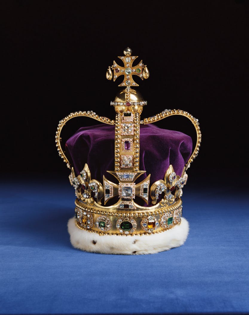
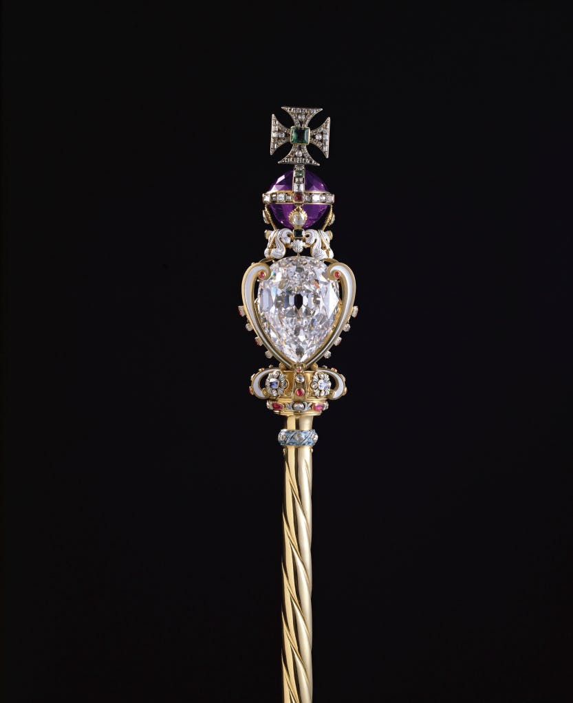
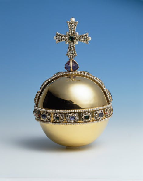
Fig 2.3 Protector of Good(Source: Historic Royal Palaces, 2001), Fig 2.4 Imperial State Crown (Source: Historic Royal Palaces, 2001), Fig 2.5 The Sovereign's Sceptre(Source: Historic Royal Palaces, 2001)
The three pictures above display the Crown Jewels of the United Kingdom, each with its unique purpose and symbolisation.
From the painting, a large crowd of spectators is seen to have witnessed the crowning of King Edward VII. In order to picture the moment with greater accuracy, research regarding the matter is needed. Thus, below is a list of royal guests invited to King Edward VII's Coronation in 1902.

Other than the members of the royalty, Great Officers of State were cordially welcomed to attend. This includes the Prime Minister and all members of the Cabinet, all Governors-General and Prime Ministers of Commonwealth realms, all Governors of the British Crown, and the Heads of State of dependent nations, aristocrats, notables, and representatives from other countries. (London Tickets, n.d.)
The Coronation Chair

I Was Kidnapped


Fig 3.2 Illustration of My Kidnapping Dream pt.2 (20/2/22)
The dinner had just ended and I was with the seniors of a club. All
four of the girls were very friendly and welcoming into their group.
They openly told their plans for the weekend despite an outsider(me)
hearing everything they were saying. There was a time when Girl 1
even helped removed the booger stuck on my nose. Needless to say, I
was stunned by the behavior of these girls but also really happy
that they were not snobbish.
When it was time to head home, I told Girl 1 that I was going to
leave and asked if she was willing to drop me off at the Bandar
Utama MRT Station since we were at 1 Utama Shopping Complex which is
close by. She questioned the name of the train station which then I
assumed, she wasn’t familiar with as she was an international
student. Anyhow, I roughly explained the gist of the name while we
were going down the escalator. Suddenly, I saw my mother’s 1990
Toyota Corona pass by the entrance of the mall. I exclaim in
surprise, “Eh! That is my mother’s car!”. Thinking that we could
manage to chase the car down, we ran for it.
When we stepped out of 1 Utama, strangely enough, we could not see
the car anywhere. That was when we began searching for it towards
the direction it had gone to. Girl 1 was leading the way and I was
following her at the back. I also felt safer in that order.
For some reason, the road had begun to slope downwards and it was
as though we were hamsters, running on a wheel. It was also as
though the earth was the wheel and we were just running on the
surface of it. As we ran, it got scarier & scarier because the
sky in front of us just keeps getting darker and darker with the
streetlights being the only source of illumination. Being a very
persistent and determined person by nature, I did not stop once in
my tracks and thought to swivel back to where we started. I
constantly reminded myself that “We already ran so far so why stop
now?”. And so, we ran and ran until...
The sky above the horizon suddenly turned a dark grey and we both
knew instantly that it was not a good sign. We turned back and I
bumped into something that made us stop us dead in our tracks.
A man with an angry facial expression was right behind us this
whole time. And the worst part was, we had no clue about his
presence. We screamed at the top of our lungs and tried to resist
his hold but failed miserably. We had no choice but to revert back
to the route we once were headed towards. There were two other men
who emerged from the trees and were now surrounding Girl 1 to ensure
she does not escape whereas the man before, was right behind me.
Strangely, all of us were running instead of walking, even the 3
men. Nevertheless, it finally sunk in my mind that I was being
kidnapped and maybe my mother’s car was just an illusion used to
lure the prey to their trap.
Gradually, the man who was guarding from behind moved in front of
me. Why did he do that, I would never know. But all I know now was
that this was my time to escape. I turned back for the second
time and I ran as fast as my legs could carry. I knew that my friend
was still kept hostage but I had no choice. I needed to save myself
first.
As I ran, something felt off. For some reason, I could not pick up
speed. It felt as though I was stuck in someone else’s lower body,
unable to garner full control of my own legs. Despite that, I could
not slow down because that would mean I have surrendered myself to
the evil.
Soon after what seemed like an eternity, I caught a glimpse of a
building. IT WAS ONE UTAMA. Then the most exciting part happened. I
woke up. The end.
Executing The Final Project
After much contemplating on which part of my dream I should choose to illustrate, I have decided to go for a combination of Scene 7 and Scene 9 (See Fig ). As a recap, No.7 describes the scene where Girl 1 and I were heading in the direction of where my mother's car went. Scene 9, on the other hand, narrates the both of us getting kidnapped by three guys that have been secretly following us all the while. However, to simplify the workload, I will only be drawing three main characters; myself, Girl 1 & one large-sized villain.
Once I have settled the theme of my final project, it was time to think of an art style that would be different from my previous works for this module. Then I remembered that Tuxen implements quite a ton of triangles in the coronation painting. This was where I thought, "Maybe I could draw all three figures using pure triangles while playing with the proximity of shapes."
Here is the first sketch in which I tried out the idea of designing a figure from triangle shapes.

Fig 3.3 Designing Figure 1 from Triangles (20/2/22)
But in order to bring this final project to another level, challenging myself and doing some sort of animation seemed like an ingenious idea at that time. (I was wrong because later in the project, I ran into a couple of hard obstacles)


Since tip-toeing was a slow and detailed movement, I drew more frames compared to the initial figure.
Rough Sketch of the Setting
In my dream, Girl 1 & I were sprinting downhill towards the dark and I know this because generally when one descends a steep slope, they are not aware of what's ahead of them and can only see up to a certain point. Hence, we just followed the unknown, being optimistic about what's to come. Besides that, the chase took place in what seemed to be a forest with ample trees surrounding the path in which we took and pertaining little illumination.
In order to recreate that scene, I chose a hemisphere as a way to represent the hill and a couple of trees on the surface of it, not forgetting to incorporate the triangles as well.


Fig 4.2 Rough Sketch of Setting Without Leaves (21/2/22)
I also experimented with removing the leaves on the trees, adding a pathway and lines to illustrate markings on the tree trunks. After that, it occurred to me that this setting resembles a wildfire that happened a few years back in several countries such as Australia and California, USA. So, I tried throwing in flames surrounding nature and this was how it turned out.

Inking & Coloring the Setting

Fig 4.4 Coloring Setting (21/2/22)


Fig 4.9 Rough Animation of Setting- short clip (22/2/22)
Rough Sketch of the Flames
I really enjoyed the idea of the wildfire despite not appearing in my dreams so I went ahead and executed it.
In order to give variety to my final piece, I drew two types of flames; flame 1 being a tall and narrow flame whereas flame 2 would be a wide and shorter flame.
Flame 1


Animating the Flames
After that, I brought the illustrated frames to Flipaclip and combined them into a short GIF.
Flame 1

Fig 5.5 Exporting Frames of Flame 1's Movement to Flipaclip (23/2/22)

Rough Animation of the Flames
Flame 1


FEEDBACKS
Week 8 / Feedback For Final Outcome
Me: Do you think the color of the figure from the most left is visible
to the viewers or should I change it to another color? Because my
intention here is to make the brown figure seem like a villain in the
shadows but it seems as though the shade of brown, I chose blended in
with the silhouette of the tree trunks.
Dr. Charles: *sends an annotated picture*

Fig 6.9 Annotated Picture (25/2/22)
Also Dr. Charles: Villains can blend and emerge. I suggest making it emerge clearly and not merely running. Because the hellish environment is already threatening the couple.
- https://www.rct.uk/collection/search?utm_campaign=col&utm_content=OTD&utm_medium=social&utm_source=facebook#/4/collection/404487/the-coronation-of-king-edward-vii-1841-1910
-
-
https://artandinfluence.com/laurits-tuxen-1853-1927
-
https://www.askart.com/artist/Laurits_Regner_Tuxen/100853/Laurits_Regner_Tuxen.aspx
-
https://www.london-tickets.co.uk/westminster-abbey/coronations/
-
https://perfumesociety.org/scented-secrets-queens-coronation-anointing-oil/
-
https://forums.tigsource.com/index.php?topic=41261.0
- https://slideplayer.com/slide/5808179/
- https://images.app.goo.gl/xhqTk8FpmyCs2ABFA

Comments
Post a Comment