ILLUSTRATION & VISUAL NARRATIVE - TASK 2
Week 5 (26/4/22) - Week 8 (17/5/22)
Student: Tai Ser Yeet (0345798)
Programme:
Bachelor of Design (Honours) in Creative Media
Task: Task 2- Decisive Moment
WEEK 5
LECTURE- COMPOSITION THEORY 03 (FORE, MID & BACKGROUND)
Purpose of planes (fore, mid & background):
-
creating a sense of space
-
illustrating 3 of the elements helps communicate a sense of
scale to viewers (e.g how big the land is, and how tall something is
in relation to other sizes of objects)
-
Design Flow- help to indicate movement & rhythm to my
design (e.g where is the attack coming from, where is the
enemy)
-
lead the eyes throughout the layout, moving from one element to
another in an orderly fashion. It is similar to implied lines of
a design. For example, in a film, a long shot is first shown so
that the viewers can observe the background & understand
where the protagonist is at that moment & then only the
scene proceeds with a close-up shot. Now, that is a good flow of
the sequence.
Foreground
- creating a sense of space
- illustrating 3 of the elements helps communicate a sense of scale to viewers (e.g how big the land is, and how tall something is in relation to other sizes of objects)
- Design Flow- help to indicate movement & rhythm to my design (e.g where is the attack coming from, where is the enemy)
- lead the eyes throughout the layout, moving from one element to another in an orderly fashion. It is similar to implied lines of a design. For example, in a film, a long shot is first shown so that the viewers can observe the background & understand where the protagonist is at that moment & then only the scene proceeds with a close-up shot. Now, that is a good flow of the sequence.
.png)
|
|
|
.png)
|
|
Fig XX Adventure Time, Week 5 (Cartoon Network, 2010)(26/4/22) |
.png)
|
|
Fig XX Adventure Time, Week 5 (Cartoon Network, 2010)(26/4/22) |
LECTURE REPORT - TASK 03

|
|
Fig XX Woody Looking At Andy's Card Driving
Away, Week 5 (26/4/22)
|

|
|
Fig XX Battle Between Voldemort & Harry
Potter, Week 5 (26/4/22)
The use of strong color contrast
during the wand dispute between
Voldermort & Harry Potter
emphasizes the focal point of the
composition. Because both the
subjects are similar in size and are
also standing at an equal distance
apart from each other, there is no
longer an imbalance of authority.
Instead, they are now fighting as
equals. Additionally, the large
difference in size between the
background & the subject matter
establishes a sense of space and
causes visual hierarchy.
|

|
| Fig XX Moment Before Dumbledore's Death, Week 5 (26/4/22) |
While all the other figures in the foreground & middle ground are swallowed by the shadows, Dumbledore is illuminated. This brings the focus directly to the focal point of the scene despite being placed in the background. It also clearly indicates the separation between the dark side and the good side, with Dumbledore dressed in a light color whereas the others dressed in dark clothing. Moreover, the high contrast of color creates a dramatic effect to the climax, making it one of the most highlighted scenes throughout the whole Harry Potter Series. Not to mention, it was the moment prior to the death of Dumbledore, the greatest wizard of all time for god's sakes.
PRACTICAL - CHIAROSCURO EXERCISE 2
This week, we are continuing with the chiaroscuro
exercise but this time, the image we would be
tracing is much more difficult to the increasing
amount of shadows & highlights. Nevertheless, it
is a fun challenge and I can't wait to
begin.

Fig XX Tracing Image, Week 5 (26/4/22)
ATTEMPT 1
I dimmed the image by 50% by making the image a
template and locked the layer. Then I proceeded
to outline the right figure, also trying to
visualize the shape of his body & head that
is covered by the harsh shadows.
.png)
Fig XX Tracing Image With Stroke, Week
5 (26/4/22)
Using the pathfinder tool, I
divided the outlines and Fig XX was
how it turned out. Because a few
outlines of the highlights &
shadows did not overlap with the
original outline of the figure,
Illustrator was not able to find the
exact path that I intended to
separate. Hence, this created a
problem for me when I needed to fill
in the colors.
.png)
Fig XX Outlining the Figure, Week
5 (26/4/22)
Some parts were left blank as I could not find a
way to fill them unless I place a shape behind the
figure to hide the colorless spots. This attempt was
also made before Mr. Hafiz demonstrated the exact
steps to achieve the illustration. After he taught
the class, I recognized my mistake of not locking
the layer containing the original outline as well as
overlapping the many outlines of shadows &
highlights. Moreover, similar to the Pear exercise,
I should have decided between doing the shadows or
the highlights because it would save time and
ultimately, allow Illustrator to easily segregate
the different sections.

Fig XX Attempt 1, Week
5 (26/4/22)
ATTEMPT 2
I locked the first layer containing the
outlines and created another layer for
the shadows. Then repeating the steps
from Attempt 1, I used the pathfinder
tool and divided the sections prior to
filling them with color.

Fig XX Attempt 2- Outlining
Figure & Its Shadows, Week
5 (26/4/22)
.png)
Fig XX Attempt 2 -Character
Without White Fill Colour, Week
5 (26/4/22)
.png)
Fig XX Attempt 2- Completed
Version, Week 5 (26/4/22)
ADDING A CLIPPING MASK
Using the exercise earlier, our next task was to
replace the shadow areas with any picture by using
the clipping mask function. But first, I made the
shadowed areas into a compound path(see Fig
XX).
.png)
Fig XX Making Compound Path On Shadow
Areas, Week 5 (26/4/22)
After that, I downloaded a paper-like texture as an
overlay to the fill color and pasted it behind the
red areas.
.png)
Fig XX Adding The White Texture On
Earlier Exercise, Week 5 (26/4/22)
In Fig XX, I changed the fill color of the shadowed
areas to a gradient blue fill for an icy, winter
feel.

Fig XX White Texture With a Gradient
Blue Fill, Week 5 (26/4/22)
In Fig XX & Fig XX, I began experimenting with
different images using the clipping mask
function.

Fig XX Liquid Marbling Paint As Shadow
Fill, Week 5 (26/4/22)

Fig XX Hexagon Shaped Pattern As
Highlight Fill, Week 5 (26/4/22)
-04.png)
Fig XX 3 Outcomes For Clipping Mask
Exercise, Week 5 (26/4/22)

|
|
Fig XX Tracing Image, Week 5 (26/4/22) |
ATTEMPT 1
I dimmed the image by 50% by making the image a template and locked the layer. Then I proceeded to outline the right figure, also trying to visualize the shape of his body & head that is covered by the harsh shadows.
.png)
|
|
Fig XX Tracing Image With Stroke, Week
5 (26/4/22) |
.png)
|
|
Fig XX Outlining the Figure, Week
5 (26/4/22) |

|
||||||
|
Fig XX Attempt 1, Week
5 (26/4/22) ATTEMPT 2
I locked the first layer containing the
outlines and created another layer for
the shadows. Then repeating the steps
from Attempt 1, I used the pathfinder
tool and divided the sections prior to
filling them with color.
|
.png)
.png)
ADDING A CLIPPING MASK
.png)
|
|
Fig XX Making Compound Path On Shadow
Areas, Week 5 (26/4/22) |
.png)
|
|
Fig XX Adding The White Texture On
Earlier Exercise, Week 5 (26/4/22) |
|
|
|
Fig XX White Texture With a Gradient
Blue Fill, Week 5 (26/4/22) |
|
|
|
Fig XX Liquid Marbling Paint As Shadow
Fill, Week 5 (26/4/22) |
|
|
|
Fig XX Hexagon Shaped Pattern As
Highlight Fill, Week 5 (26/4/22) |
-04.png)
|
|
Fig XX 3 Outcomes For Clipping Mask
Exercise, Week 5 (26/4/22) |
WEEK 6
LECTURE - PERSPECTIVE
Perspective directs the eye to
the most important part of the
scene. There are 3 types of perspective:
one-point, two-point, three-point
& isometric grid. It can be a combination of two or
more perspectives in a
design.
One-point perspective:
- the nearer the vanishing point,
the smaller it gets.
- create a sense of depth &
size
- get to see the usage of
foreground, midground &
background
- dynamic expression (mostly used
in anime, to indicate
excitement)
Two-point perspective:
- vanishing points on either side
of the horizon that
intersects
- e.g buildings are drawn using
two-point, during establishing
shots
- show a sense of space and
dimension
Three-point perspective:
- bird's eye view or worm-eye
view
- goes beyond the horizon line so
that's why the subject can look
gigantic or very tiny
Isometric view:
- create detailed concepts of
individual buildings
- allow to clearly present 3
sides of your design without
distorting perspective
- e.g use for games (e.g Hayday, clash
royale) and infographics
Dynamic Application
- perspective does not have to be
boring and you do not have to
follow the rules so rigidly.
- mixing different perspective
methods (have an uncommon angle
for a particular scene)
- able to create an illusion
(trick the viewers)
- put subjects on different
horizontal planes to distinctly
differentiate between the foreground
& background.
|
LECTURE REPORT- PERSPECTIVES
 |
| Fig XX One-Point Perspective, Week 6 (6/5/22) |
 | |
|
 | |
|
|
|
PRACTICAL - COLOR BASICS
.png)
|
|
Fig XX Creating a Fill Line Through the Pathfinder, Week
6 (6/5/22) |
We were instructed to select a color palette of our choice on the Adobe Color website. I chose a simple color theme consisting of a dark pink and various shades of green. To color the flower, I placed a green-filled rectangle behind the flower outline and merge them together using the pathfinder tool.

|
|
Fig XX Coloring the Flower, Week 6 (6/5/22) |

|
|
Fig XX Experimentation on Coloring The Hands, Week
6 (6/5/22) |
.png)
|
|
Fig XX Closing the Hands Using the Blob Tool, Week
6 (6/5/22) |
.png)
|
|
Fig XX Making the Lines More Realistic, Week
6 (6/5/22) |

|
|
Fig XX Adding Shadows Within the Isolated Area,
Week 6 (6/5/22) |

|
|
Fig XX Creating the Background & Adding
Texture, Week 6 (6/5/22) |
.png)
|
|
Fig XX Outline View of Design, Week 6 (6/5/22) |

|
|
Fig XX Final Outcome of Color Basics Design, Week
6 (6/5/22) |
WEEK 7
LECTURE - ACTS STRUCTURE
- Central Theme- 2 types of the theme (Major & Minor Theme)
- Conflict- is what drives the entire story. Without conflict, the story becomes unentertaining.
- Characters - decide the protagonist & antagonist
INSTRUCTIONS
Fig XX Module Information Booklet, Week
5 (26/4/22)
WEEK 5
DECISIVE MOMENT
Fig XX Instructions to Decisive Moment,
Week 5 (26/4/22)
For Task 2, we are instructed to pick a
specific moment from any medium such as
a movie, manga, book, or TV show and
translate it into a minimalist poster
while bearing in mind the application of
composition theory & layout. Also,
create the visuals in a way that speaks
for itself. For context, with a blink of
an eye, the audience already knows which
scene are you replicating from the
movie.
RESEARCH
Despite being able to pick a momentous
narrative from any medium of entertainment,
however, I would just like to focus on
movies to make the selection process less
overwhelming and simpler. Below is a
list of my favorite movies which in no particular order of
importance.
Favorite Movies
-
Toy Story 3
-
Princess Diaries
-
Legally Blonde
-
The Crown: Netflix Series
-
Harry Potter Movie Series
Similarly, I also began searching for
important scenes in those movies especially
plot twists, cliffhangers, conflicts, and
climaxes on the web. YouTube was
particularly useful in helping me recall
those moments which evoke strong
emotions.
During the process of researching, I
gathered all the powerful & transitional
narratives along from each listed movie with
attached video links for reference. (Refer
below)
Compilation of My Favorite Scenes From Each
Movie
1. Toy Story 3
3. Legally Blonde
4. The Crown
.png)
Fig XX Comparison Between
the Actual Moment &
the Reenactment of the
Moment, Week 5 (Source:
The New York Times,
2013)(26/4/22)
Even though this particular moment was not
shown in The Crown, an episode was dedicated
specifically to the day of the tragedy.
Anyhow, to describe Fig XX, Jacqueline
Kennedy, wife of President J.F. Kennedy, continues to wear her blood-stained,
pink Chanel suit after her husband was
assassinated in Dallas, Texas.
5. Harry Potter
-
Sorting hat decides Harry Potter's
house
-
Dumbledore falls to his death
-
Neville Longbottom has the Gryffindor
sword
-
Harry Potter gave Dobby a sock
-
Dobby saves Harry Potter & friends
in Malfoy Manor but gets killed in the
end (Deathly Hallows 1)
-
Voldemort fights with DumbleDore
-
Voldemort touches Harry's forehead with
his finger
-
Battle of Voldemort & Harry
Potter
-
Lily James Potter saves Harry from
Voldemort
-
Snape hugs Lily Potter after she
dies
There were too many iconic movie scenes to
choose from, making it rather overwhelming
& hard to decide which I would like to
carry out. In the end, I asked myself this one
question,
"Will the audience recognize which scene my
poster is trying to replicate & is it
iconic enough?"
In the back of my mind, I thought of a
combination of three scenes in Toy Story & Harry Potter that fulfill those criteria.
In Toy Story, it was the ending part where
Andy leaves for college without Woody &
friends. Meanwhile, in Harry Potter, it was
the death of Dumbledore, the first return of
Voldemort in Goblet of Fire & lastly,
the battle between Voldemort & Harry
Potter.
Later on, I revisited the list of moments & I finally narrowed the options to just scenes from the Harry Potter series.
INSPIRATION
After shortlisting my decisive moment, I began searching for reference images from each movie scene in order to accurately sketch out the characters for the next step. Below are the pictures:
1. Return of Child-Like Voldemort
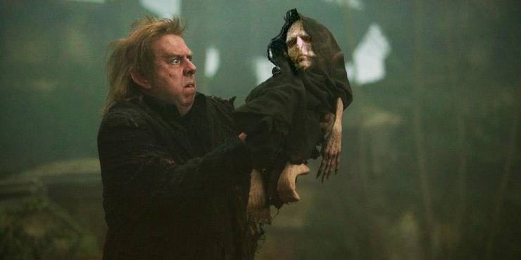
Fig XX His Child-Form Was Resurrected(Source: Lealos, 2021)(26/4/22)
2. Death of Dumbledore At The Astronomy Tower 
Fig XX Snape About To Kill Dumbledore(Source: Ottowl, n.d.)(26/4/22)

Fig XX Snape About To Kill Dumbledore(Source: Tobilow, 2021)(26/4/22)

Fig XX Harry Potter & the Half-Blood Prince (Source: Beck, 2018)(26/4/22)

Fig XX Battle of the Astronomy Tower (Source: Harry Potter Wiki, n.d.)(26/4/22)
After the image compilation, I began to notice the importance of a proper color scheme in delivering a suitable mood & tone to the scene. In all of the illustrations, a certain type of bright green color is used, similar to the shade chosen in the movies themselves. In this case, the green light indicates a magic spell known as 'Avada Kedavra' & it happens to be the killing spell. Whenever a wizard mouthes this particular charm onto an individual, they would instantly be murdered and there is no way in reversing it. Therefore, when one sees this specific color of the spell, something very serious has occurred.
Other than that, the greenish-blue filter used in the artworks was seen throughout the "Half-Blood Prince" Movie therefore was also mimicked in the design. (See Fig XX)
SKETCHING

Fig XX Sketch 1, Week 5 (26/4/22)
Sketch 1 - The
first sketch is a scene from GOF where Harry & Cedric are running towards
the Triwizard Cup not knowing that it is actually a portkey leading them
straight to Voldemort & the Death Eaters. I have not thought of a suitable
tagline for this yet.

Fig XX Sketch 2, Week 5 (26/4/22)
Sketch 2- Sketch 2 shows a very weak
and almost baby-like Voldemort cradled by his loyal servant, Peter Pettigrew.
This shows that Voldemort has returned once again.

Fig XX Sketch 3 & 4, Week 5 (26/4/22)

Fig XX Sketch 5, Week 5 (26/4/22)
Sketch 3, 4 & 5- Third & fourth sketch is from "Harry Potter & the Half-Blood Prince" where I am illustrating
the death of Dumbledore after Snape struck him with the Avada Kedavra magic
spell. In terms of composition, I applied the concept of the Rule of Thirds in which as humans, we are more inclined to glance towards the intersection points spread across the grid, especially the upper left of the artwork.
For Sketch 3 & 4, I placed Dumbledore on the lower right intersection point followed by a strike of green light from the window above. This helps the viewers decipher what is going on in the scene through the use of implied lines.
For Sketch 5, I positioned the astronomy tower on the left side of the poster. Next, Snape was also placed right smack on the upper left intersection point to guide the human eye to him first. Similar to Sketch 3&4, I drew a neon-green line that connects one character to another.
FEEDBACKS
I consulted Ms. Anis regarding my sketches and here was what she said. She suggested removing the mention of the name (Severus) because it would be a spoiler if I do so. For Sketch 4, she advised me to enlarge the entire composition. Overall, she believes that Sketch 4 has the most potential as it has nice suspense to it. In order to get a second opinion, I asked my brother about my sketches. He told me that in regards to Sketch 3&4, only Harry Potter fans were able to tell what the scene entails. As a result, this narrows down the scope of the audience that would actually understand & enjoy the storyline. Therefore, it would be better if I chose Sketch 4 as my composition so that viewers could at least decipher that a crime scene was occurring.
RESEARCH
- Toy Story 3
- Princess Diaries
- Legally Blonde
- The Crown: Netflix Series
- Harry Potter Movie Series
.png)
|
|
Fig XX Comparison Between
the Actual Moment &
the Reenactment of the
Moment, Week 5 (Source:
The New York Times,
2013)(26/4/22)
|
- Sorting hat decides Harry Potter's house
- Dumbledore falls to his death
- Neville Longbottom has the Gryffindor sword
- Harry Potter gave Dobby a sock
- Dobby saves Harry Potter & friends in Malfoy Manor but gets killed in the end (Deathly Hallows 1)
- Voldemort fights with DumbleDore
- Voldemort touches Harry's forehead with his finger
- Battle of Voldemort & Harry Potter
- Lily James Potter saves Harry from Voldemort
- Snape hugs Lily Potter after she dies
INSPIRATION
|
Fig XX His Child-Form Was Resurrected(Source: Lealos, 2021)(26/4/22) |
|
Fig XX Snape About To Kill Dumbledore(Source: Ottowl, n.d.)(26/4/22) |
|
Fig XX Snape About To Kill Dumbledore(Source: Tobilow, 2021)(26/4/22) |
|
Fig XX Harry Potter & the Half-Blood Prince (Source: Beck, 2018)(26/4/22) |
|
Fig XX Battle of the Astronomy Tower (Source: Harry Potter Wiki, n.d.)(26/4/22) |
SKETCHING
 |
Fig XX Sketch 1, Week 5 (26/4/22) |
 | |
|
| |
|
 | |
|
FEEDBACKS
DIGITALIZATION
RESEARCH
After the feedback, I ended up choosing Sketch 4.
MOVEMENTS OF DUMBLEDORE
Fig XX Body Movement of Person Falling, Week 5 (Source: Shutterstock, n.d.)(26/4/22)
STYLE OF ARCHITECTURE
Fig XX Front View of Astronomy Tower, Week 5 (Source: artObserver, 2017)(26/4/22)

Fig XX Worm's Eye View of Astronomy Tower, Week 5 (Source: artObserver, 2017)(26/4/22)
.png)
Fig XX 3-Dimensional View of Astronomy Tower, Week 5 (Source: artObserver, 2017)(26/4/22)

Fig XX Structure of Astronomy Tower, Week 5 (Source: Wolf, 2020)(26/4/22)
TYPEFACE DESIGN
Fig XX Illustration
by Mary GrandPré & cover by Brian Selznick, Week 5 (Source: Scholastics, n.d.)(26/4/22)

Fig XX Harry Potter & the Half-Blood Prince Movie Poster, Week 5 (Source: Wolf, 2020)(26/4/22)
TRACING OF IMAGE


COLOR PALETTE


TITLE PLACEMENT


GIF ANIMATION
Fig XX Example of Free-Falling, Week 5 (Source: Tenor, 2016)(26/4/22)
Fig XX Example of Free-Falling 2, Week 5 (Source: Laureau, n.d.)(26/4/22)
Fig XX Example of Free-Falling 3, Week 5 (Source: Tahiri, n.d.)(26/4/22)

Fig XX Example of Free-Falling 3, Week 5 (Source: Pinterest)(26/4/22)


FINAL SUBMISSIONS
|
| Fig XX Body Movement of Person Falling, Week 5 (Source: Shutterstock, n.d.)(26/4/22) |
|
| Fig XX Front View of Astronomy Tower, Week 5 (Source: artObserver, 2017)(26/4/22) |
| |
|
.png) |
| Fig XX 3-Dimensional View of Astronomy Tower, Week 5 (Source: artObserver, 2017)(26/4/22) |
|
| Fig XX Structure of Astronomy Tower, Week 5 (Source: Wolf, 2020)(26/4/22) |
| |
|
| |
|
|
Fig XX Example of Free-Falling 3, Week 5 (Source: Pinterest)(26/4/22) |
FINAL SUBMISSIONS
MINIMALIST POSTER
Fig XX Final Submission of Minimalist Poster, PDF, Week 9 (Source: Pinterest)(29/5/22)
 Fig XX Final Submission of Minimalist Poster, PNG, Week 9 (Source: Pinterest)(29/5/22)

ANIMATED GIF
.gif)
Fig XX Final Submission of Animated GIF, GIF, Week 9 (Source: Pinterest)(29/5/22)
.gif) |
Fig XX Final Submission of Animated GIF, GIF, Week 9 (Source: Pinterest)(29/5/22) |
FEEDBACKS
WEEK 7 - SKETCHES
REFLECTIONS
EXPERIENCE
I had fun with Task 2 mainly because we got to choose our own movie. It was the creative freedom that allowed me to experiment beyond my expected limitations. This was the project that also tested my knowledge of the Adobe Illustrator software. Task 2 also encouraged me to practice the Rule of Thirds more often when planning a composition. Indeed, the concept is crucial in drawing the viewer's attention to the correct sequence of elements & understanding the meaning behind the artwork. Nevertheless, I am extremely content with my final submission & I would proudly share it with everyone.
EXPERIENCE


Comments
Post a Comment