Week 1 (30/3/22) - Week 14 (3/7/22) Student: Tai Ser Yeet (0345798) Programme:
Bachelor of Design (Honours) in Creative Media Task: Project 1- Vormator
Challenge & Game Card Design
WEEK 1
LECTURE:
We met Miss Anis & Mr Hafiz for the first time in class. Later, we were briefed on our upcoming assignments such as the Vormator Challenge, Game Card Design, Web Toon and so on.
PRACTICAL :
BEZIER GAME
Fig 1.1 Tracing a car in Bezier Game, Week 1 (29/3/22)
For the practical session, my classmates and I were tasked to give the
Bezier Game a try. For context, the game was designed for users to
master the Pen Tool which could be found on most Adobe platforms. Initially,
I had confidence in myself as I already tried out Adobe Illustrator during
the first-semester break but boy, was I struggling. I was doing just fine
until I had to trace a car (See Fig 1.1). There were a few attempts where I
used up all the nodes but ultimately, I got passed it.
Fig 1.1.2 Second Attempt in Bezier Game, Week 1 (31/3/22)
Unfortunately, I lost progress on the first attempt so I proceeded to play
the game once more. Since I had some practice in Digital Photography class,
I managed to obtain a high score on my second attempt! Yay!
WEEK 2
LECTURE :
When designing a character, ask yourself,
"Is my character iconic, simple & unique enough?"
1.
Iconic: Can my character be recognized even in a form of a black
silhouette? What are the shapes that make my character
iconic/memorable?
2. Simplicity: Is the narrative of the character easily grasped through its
appearance?
3. Unique:
Does my character have its own flare?
PRINCIPLES OF CHARACTER DESIGN
1. Shapes
Heroes in movies have a sturdy, stable combination of shapes (e.g
rectangle, square) whilst villains tend to have the opposite such as an
inverted triangle. Unstable compositions most likely evoke a sense of
uneasiness within the viewers.
Fig 2.1 Lecture Slide 1, Week 2 (31/3/22)
As seen in Fig 2.1, utilizing shapes is one of the ways to add
depth to the character's personality.
2. Colour
The choice of color helps differentiate the characters. For example,
heroes mostly wear lighter colors which are easy on the eyes whereas the
evil villains would lean more toward darker shades of clothing. As a
whole, both are contrasting each other, allowing for easier
grouping.
3. Emphasis & Contrast
In contrast to the other elements, both emphasis & contrast
typically go hand in hand with one another. When a certain
characteristic of the subject requires to be emphasized, a high
contrasting color is used. Other than that, depending on the film, contrasting elements could also be used to hint at a figure's common
dispositions as well as the exaggeration of the physical features such
as height and face.
4. Harmony
Every element of my design ought to be cohesive with each other. For
instance, all shapes, colors, and patterns must merge and work well
together as a whole. Visual hierarchy is one way to harmonize the
variety of different elements in each character design. By bringing
forth important elements such as similar use of basic shapes or the same
color, a harmonious design is formed.
5. Expressions & Poses
Clear and distinct characteristics of my personalized characters
increase the audience's engagement in your design. Something that your
viewers will remember your character by.
PRACTICAL :
Fig 2.1.2 Tracing shapes in Illustrator, Week 2 (5/4/22)
For practical class, we were instructed by Mr.Hafiz to trace
out a template, filled with a variety of shapes. The main tools
we were taught to use were the Pen Tool & the Curvature
Tool.
LECTURE REPORT - CHARACTER DESIGN BASICS (300 WORDS)
Fig 2.1.3 Phineas & Ferb, Week 2 (5/4/22)
Phineas & Ferb is one of my favorite TV shows ever since
I was a little kid and one of the reasons was due to its
chosen color palette. In Fig 2.3, the characters, Phineas
& Ferb have hair colors that complement each other,
bringing a harmonious tone to the animated cartoon.
Additionally, this gives dynamicity to each of their
personalities, because after all, they are deemed partners in
crime anyway. Both of them were also designed using merely
primitive shapes such as rectangles and triangles, therefore,
allowing the viewers to easily draw or recognize them at any
time. For example, Phineas's trademark is his abnormally sharp
nose while Ferb is designed with an oddly long neck and a flat
nose. Furthermore, it can be observed that Phineas has an unstable
body structure which explains his impulsive but passionate drive
at inventing new contraptions. For Ferb, he balances Phineas's
nature by being more tranquil but supportive. Other than that, both the boys have significantly different
size mouths. Because Phineas typically does all the talking for
his twin brother, Ferb hence his mouth takes up almost half of
his face. On the other hand, Ferb which is very reserved tends
to have a relatively tiny mouth.
Fig 2.1.4 Dr. Doofenshmirtz, Week 2 (5/4/22)
Dr. Doofenshmirtz is an evil scientist that only has only one
goal in mind; to take control of the tri-state area. His inner
motive could be easily deciphered by many through his facial
structure. For instance, his elongated nose, upturned eyebrows,
underbite jaw and hunched back. According to a historian, Fay
Bound Alberti, individuals with a physical deformity such as a
hunched back tend to be associated with having a psychological
deformity. (Smith,2016) This particular finding further proves his
odd demeanor. Overall, in contrast to other characters in the TV
Series, he was made to look frightening so that viewers are able
to identify that he is the villain. In terms of his outfit, since
he is a scientist thus he wears a white lab coat and an inner
black turtleneck.
[321 words]
WEEK 3
LECTURE - CHIAROSCURO
What is the definition of Chiaroscuro? It is the use of
lighting to create an illusion of a 3D form. The technique is known as the clear tonal contrast or in other
words, a clear change of light from the original color. The
purpose is to bring tension to a particular scene by highlighting
the subject's importance using contrast in lighting and
colors. Examples of artists that utilize the technique are Leonardo Da
Vinci & Caravaggio.
Tenebrism is a type of painting method similar to Chiaroscuro
whereby most of the areas of the artwork are dark or have a dark
background. Hence, the brightly illuminated object is clearly seen
due to the color contrast.
Secondly, low-key lighting is used for Chiaroscuro. The style of
lighting used in films, and photography. It accentuates the contours of a subject by making areas into shadow
while having a subtle illumination of the main subject. Playing
with light also enables a scene to deliver a strong emotion very
well.
Chiaroscuro helps differentiate between positive & negative
space. For context, positive space(light) shows the subject whereas negative
space(dark) shows the secondary element.
The technique could be used in order to :
1. increase dramatic tension
- provides depth and feel to the scene
2. create a sensational effect
- Puts emphasis on the narrative
3. attract attention
- show visual hierarchy (highlighting the main point of the
scene)
Write a short report (min.500 words) about how the lighting in
the movie impacted and accentuated the importance of the
particular scene in the narrative.
There are many instances whereby the Chiaroscuro technique was cleverly used to set the tone and mood
of the story.The scene starts off with Chuckles, the Clown narrating his past
involving Lots-o and Big Baby to Woody & his friends in a dark
setting.Because the setting was dimly lit, the light source coming in from the
window unintentionally spotlighted Chuckles thus drawing the
viewer's attention towards that area of the composition(Fig 3.1).
Next, in Fig XX, a hard shadow was cast on Woody's friends,
signifying them as the supporting elements of the story. As for
Woody & Chuckles, they were positioned in the light,
therefore, emphasizing the importance of their roles as well as
differentiating the positive and negative space in the scene. Despite Chuckles rarely appearing in the movie, we could
still deduce his innocence and gentle character through lighting.
Evidently, the full-face lighting highlights Chuckles' sad facial
expression which in turn, helps gain sympathy from the
audience.
Fig 3.1.2 Moment of Realisation that They
Have Been Replaced, Week 3 (12/4/22)
When the trio finally made it back to Daisy's house, they
immediately climb their way up to the window but only to
discover that they had been replaced. In Fig 3.1.2(Left), the original Lots-o and Chuckles were
placed in the shadows whereas the replacement Lots-O who
was brightly colored became the focal point of a scene. Due to the strong difference in tonal contrast, the
focal point would be the first thing that the viewers
would notice hence, promoting good use of visual hierarchy
here. Not to mention, this allows viewers to quickly
decipher the storyline of the scene. Furthermore, the warm tone lighting cast on Daisy and the replacement
bear contrasting with the cool tones shadows covering the
original Lotso & Chuckles signifies the shifts in mood
of the scene from hopeful to despairing. The audience could
also observe that any flickering hope remaining in the characters was slowly
fading through the gradient light on the Original Lots-o
& Chuckles. The top of both of their heads was in
shadows whereas the lower part was still illuminated by
the warm light.
Fig 3.1.4 Arrival at SunnySide DayCare, Week
3 (12/4/22)
In Fig 3.1.3, Lots-O was already thrown into the shadows whereas Big Baby continued being in the light. Through the contrasting difference in lighting, the viewers could conclude that Big Baby was still emotionally unwilling to give up on Daisy. Not only that, the sparkle within Big Baby's blue eyes gave the impression of the longing to be back in her owner's presence. Fig 3.1.3 was the segment where three of them accidentally fell off of a truck they were riding on after their heartbreaking discovery. The low-intensity streetlight being the only light utilized in that scene elevates the dramatic tension between the current evil Lotso and the previously sweet-natured Lotso. Not only that, but the audience could also deduce that Lots-o is now in control of the other two supporting characters, Chuckles & Big Baby who are engulfed in the cool shadows. Moreover, split lighting is used on Lots-o whereby half of Lots-o's face is illuminated whereas the other half is in shadows. This radiates a sense of mystery and intimidation. Again, the strong illumination in comparison with the dark background has highlighted the arrival at the daycare center which was where it all began. Lastly, because of the lighting, what was supposed to be a wholesome and joyful daycare turned into a place of horrors.
[566 words]
WEEK 4
LECTURE - COMPOSITION
Basic Understanding:
We arrange elements to bring out the meaning. By that, arranging the focus of the scene to stand out (can be brightly colored costume, standing position, etc)
Purpose of arrangement:
1. Visual narrative-
visuals in the scene must complement the story & subject
example 1- if it is a fight scene, wear bright color contrast, place momentum effects (like those lines drawn)
example 2- the plants behind violet grow over time as the story progresses which also indicates some time has already passed (See Fig 4.1)
How to create a visual narrative? Answer: think of the look & feel// emotions of the scene
Fig 4.1 Violet Evergarden, Episode 10: "Loved Ones Will Always
Watch Over You" Week 4(Kyoto Animation, 2018)(22/4/22)
2. Visual Flow-
a clear flow of visuals that directs the viewer's eyes
usage of the rule of thirds in order to achieve the effect. We can again utilize color contrast to guide attention from one thing to another.
allows viewers to explore around the scene
Fig 4.1.2 Demon
Slayer: Kimetsu no Yaiba – The Movie: Mugen Train, Week 4 (UFOTABLE, 2020)(22/4/22)
3. Visual Balance-
arrange elements to maintain balance in the composition
guide viewer's eye to a path you want them to take
e.g artists could exaggerate the subject by painting with loud colors, having the subject wear sparkling embellishments, or even have heavy make-up.
TYPE OF CAMERA SHOTS
6 types of shots:
1. Establishing
identifying the movie's setting
allow viewers to take in all the distinct elements of a location
2. Bird's Eyeview
also known as an overhead shot
POV is directly above the subject at a 90-degree angle
3. Frame Within a Frame
helps to create screen space
add depth because the first frame shows the foreground and the second, at the background
highlight underlying meaning within your story
Fig 4.1.5 Example of Frame Within a Frame, Week 4, Mulan
(Disney, 1998)(22/4/22)
4. Medium Shot
three-quarters of the character
interactions between the many characters
5. Close-up
show intimate moment, a look into the character's mind
emphasize the change of emotions & thoughts
6. Worm's eye view
also, a way to look into a character's mind
make viewers look out of their comfort zone because not all of us are comfortable looking at this particular angle
LECTURE REPORT - TASK 03
Examples of 6 different compositions
1. Establishing shot
Fig 4.1.6 Examples of Establishing Shot, Week 4(23/4/22)
Locations : One Utama Center Court(LEFT), Grandmother's House In Setapak (RIGHT)
Fig 4.1.7 Example of Establishing Shot, Week 4(23/4/22)
Locations : One Utama Car Park
2. Bird's Eyeview
Fig 4.1.8 Examples of Bird's Eyeview, Week 4(23/4/22)
Locations : One Utama Center Court
3. Frame Within a Frame
Fig 4.1.9 Examples of Frame Within A Frame, Week 4(24/4/22)
Locations : Neighbourhood Park
4. Medium Shot
Fig 4.2 Examples of Medium Shot, Week 4(24/4/22)
Locations : Grandmother's House In Setapak
5. Close-up shot
Fig 4.2.2 Examples of Close-Up Shot, Week 4(26/4/22)
Locations : Grandmother's House In Setapak
6. Worm's eye view
Fig 4.2.3 Examples of Worm's Eye View, Week 4(26/4/22)
Locations : Grandmother's House In Setapak
PRACTICAL - CHIAROSCURO EXERCISE 1
We first outlined the shape of the pear using the pen tool and then proceed to use the pathfinder tool in order to divide the highlights & shadow areas.
Mr. Hafiz demonstrated the how-tos of the knife tool which we would need to slice up the pear into a few segments. After that, the inner flesh is added with the eclipse tool accompanied by the curvature tool to curve the top path.
Fig 4.2.5 Process of Slicing the Pear, Week 4 (22/4/22)
The pear's seeds are created with a droplet shape from the vormator elements. Next, highlight is applied to three quarters of its surface with the same shape alongside using the shape builder tool to subtract unwanted areas. When that is completed, the seed is tripled and positioned 45 degrees apart from each other, making a half rotation. Later, the group of seeds are planted smack center of the pear.
Fig 4.3.2 Final Skeleton Pear(LEFT)// Final Skeleton(RIGHT), Week 4 (22/4/22)
INSTRUCTIONS
Fig 5.1 Module Information Booklet, Week 3 (11/4/22)
WEEK 3
VORMATOR CHALLENGE
Fig 5.1.2 Instructions to Vormator Challenge, Week 3 (11/4/22)
RESEARCH
In Fig 5.1.3, the content creator suggested looking for ideas & inspiration on an art platform called Behance. The artist has already included the outlines of their design which could help during the process of creating my character, especially when I do not know where to begin.
Before starting the brainstorming session, there are a few factors to consider such as facial expressions, proportions, outfit, hairstyle & human poses. So, my decision on these criteria were:
1. Facial Expression:Kind & Warm expression.
2. Facial Features: Downturn eyes & eyebrows. Relatively small mouth in comparison to overall face. Button nose.
3. Proportions: Large body but very small head. Extremely short but wide limbs.
4. Outfit: Leotard
5. Hairstyle(if any): No hair but wearing a fitted headwear
6. Human Poses: Standing with fingers pointing at each other// Doing a dancing pose
SKETCHING CHARACTER
To begin with, I knew that blindly sketching the character without bearing in mind the set shapes would be a pain because this would increase the difficulty of digitalizing it on Adobe Illustrator. Hence, to avoid the problem, I traced the essential vormator shapes on the Autodesk Sketchbook mobile application & started rearranging the shapes until it forms somewhat a decent character.
Sketch 1- The character is a sensitive & shy individual which can be seen by his closed-off body language. While I was designing this, I also specifically wanted him to look similar to Wall-E (a cartoon character) with a downturn facial expression and a squarish body. Next, his body proportions allows the viewers to feel secure & stable at the sight of him as the base is larger than the top therefore promoting a stable composition which also implies he is most probably the hero in the movie.
Sketch 2- The character is performing a modification of an Arabesque pose in which the only difference is his arms are swaying towards the direction of the bottom right corner. Funny enough, Sketch 2 also has an opposite personality from Sketch 1. In terms of body language, we can depict that Sketch 2 is someone gone through so much that nothing could bother him anymore. Thus, he now lives a very carefree life. Unlike Sketch 1, Sketch 2 evokes tension within the audience due to his irregular body proportions, making him seem unstable and odd.
Thoughts
When I was finished with Sketch 1, I felt that it was too simple & common. Most of the outcomes I had come across in regards to the Vormator Challenge were all front-facing and did not have a side profile. Wanting my character to stand out from the rest, I made a decision to go with Sketch 2. Not to mention, I want my character to represent who am I as a person. In a way, yes, Sketch 1 truly resembles my disposition in the past but I have long moved past that stage of my life. On the other hand, Sketch 2 illustrates my desire to be a more confident person overall.
DIGITALISATION OF CHARACTER
As seen in Fig 5.2, I traced Sketch 2 with the given Vormator shapes, scaling proportionally as I go along.
Fig 5.2 Tracing Sketch 2, Week 3 (12/4/22)
After merging the shapes together using the Shape Builder Tool, the final character looked very odd & it was not what I had imagined it to be. I envisioned it to be more of a ballerina, dancing gracefully on one leg but the final outcome resembles more of a monster with its distorted body figure and disproportionate hands.
Fig 5.2.2 Character 1, Week 3 (12/4/22)
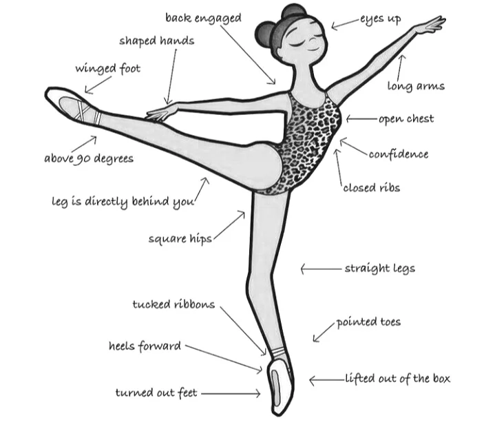
After that failed attempt,I had realised there could be a possibility that I was not knowledgeable in the area of ballet. In order to create a more realistic character, I had to learn more about the ballet poses & techniques, a ballerina's facial expression while performing, and such. Fig 5.2.3 & Fig 5.2.4 shows the images I referenced when refining my character.
Fig 5.2.4 Reference Photo For Ballet Pose, Week 3 (12/4/22)
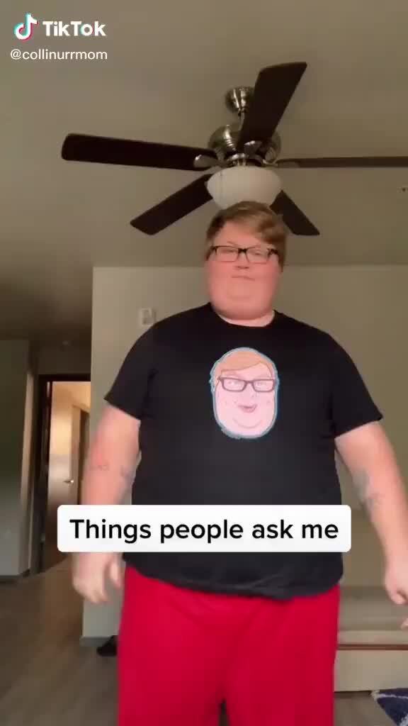
Out of the blue, I was suddenly reminded of this guy I came across on TikTok. His name is Colin & he uploads humorous content on the app. What made him exceptional memorable was his quirky facial expression(See Fig 5.2.5). Not to mention, his body dimensions (See Fig 5.2.6) coincide a plushie e.g teddy bear. I found him very cute therefore I thought, "Let's create my character to look and act more like him."
Fig 5.2.5 @Collinurrmom, Week 3 (12/4/22)
Fig 5.2.6 @Collinurrmom's body proportions, Week 3 (12/4/22)
After getting a grasp of the ballet pose that I planned to do & having Colin as my reference, I began the digitalization process.
Fig 5.2.7 Character 2, Week 3 (12/4/22)
Below is a comparison between the first attempt & the second attempt. The second attempt looked more human & easy-going.
Fig 5.2.8 Experimentation On Its Body, Week 3 (12/4/22)
Next up, I worked on creating my character's style of
clothing. Since Character 2 is a ballerina, having a tutu on him is a must.
Talking about Fig 5.2.9, Attempt 1 was made according to the first attempt on
perspective (See Fig 5.3.2) in which the left leg is lifted perpendicular to the
right leg which was standing in an upright position. However, it did not turn
out well so I redid the tutu, and Attempt 2 was its end result.
Fig 5.2.9 Experimentation On Tutu, Week 3 (12/4/22)
The scarf was a pretty straightforward process where I pieced the curved shapes together to form one long neckwear.
Fig 5.3 Experimentation On Scarf, Week 3 (12/4/22)
Something did not click when I completed Attempt 1 so I tried another approach to merging all the shapes.
Fig 5.3.2 Experimentation On Perspective, Week 3 (12/4/22)
Miss Anis once said that if your character's silhouette is easily recognizable, it is iconic enough. I am very proud of my character because it has its own distinct flare to it.
Fig 5.3.3 Silhouette of Character, Week 3 (12/4/22)
COLORING THE CHARACTER
Last but not least, the character needs to be colored. This step is crucial in communicating the idea behind the subject, differentiating and emphasizing certain characteristics important to the storyline.
I began by choosing a few suitable themes that best suit my character's courageous and confident personality. For context, I am looking for themes with a mixture of warm & cool tones. Warm shades that are leaning more toward red whereas cool tones gravitate toward green and blue colors.
Fig 5.3.4 Picking Color Theme on Adobe Colors, Week 3 (12/4/22)
Now for my character, I wanted the focus to be on his legs to highlight the courage of being a dancer despite the stereotypical mindset that overweight individuals are not fit to be one of them. Thus, I made sure that the white tights wore on the legs and the red leotard are contrasting one another, bringing our attention to it at first glance. The rest of the elements were colored to compliment the leotard.
Fig 5.3.5 Chosen Colors From Selected Theme, Week 3 (12/4/22)
FINAL SUBMISSION OF VORMATOR CHARACTER
At the end, I questioned myself, "Is it iconic, unique & simple enough?"
And my answer was.... YES, YES, YES!! This was the moment when my character was born & I name it, Ingrid.
Fig 5.3.6 Final Submission of Vormator Character, PDF, Week 3 (12/4/22)
WEEK 4
GAME CARD DESIGN
RESEARCH
Before beginning any assignment, gathering sources & inspiration is key to a good outcome and my go-to art website would be Pinterest, Behance as well as Dribbble.
Fig 5.3.7 Pinterest Board, Week 4 (22/4/22)
I especially love the color theme of this piece and its composition. The symmetrical balance applied in this design gives emphasis to the main subject, Tiana. Not only that, the focus was further enhanced with the use of the spotlight, shining directly at her. In terms of background color, the red curtains not only contrast with the subject's white dress but also sets a rather dramatic mood & intense atmosphere.
When I was looking through Pinterest, I also came across art nouveau & tarot cards by accident. It definitely opened my eyes to more possibilities that I could dive into for my game card design such as mimicking the extensive use of curved forms & arches at the corner of posters (See Fig 5.4), abundant use of organic shapes as well as the choice of color.
There was a day when I was mindlessly scrolling through TikTok(again) when this video popped up on my feed. It was the creator's most popular video from his account. I thought that was the perfect timing because that video happened to be my favorite TikTok video of all time due to its
setting at a cathedral as well as the dim lighting. The spotlight is
the only source of illumination in the video, therefore, giving full
emphasis to the musician. Not only that, a sense of loneliness and
solidarity is felt when the song is played. It makes one
picture the backstory of this man, "Why is he playing this sad piece
by himself at a cathedral? Has he been through a tough past & is
there to grieve a loss of his loved ones?" I absolutely adore the
element of mystery in this short video.
In accordance with the outstanding performance by Alex Brown, I had
decided to reference his choice of lighting in the video to my game
card design.
CREATING A STORYLINE
Growing up, I always had poor luck when I participated in activities, especially card and board games. Because I was hardly ever a winner, I became bitter toward the entire ordeal and that feeling still lingers today. Now, since I have full control over the game I am about to construct, I thought, "Why not take this opportunity to create a card that would help people having similar problems like mine? To help them actually win more rounds and make others pay for their consistent luck?"
SKETCHES
Other than making my character vengeful, I wanted the Ingrid card to also be a power card, similar to the UNO cards whereby players would have the +2 & +4 cards. To put it simply, the Ingrid card needs to be extremely powerful so whoever has it in their possession has a huge advantage over the other players. With that said, the background of the card has to match its usage & power.
In order to do so, I have incorporated a similar ambient setting from the previous TikTok video with the only source of lighting shining onto the main subject. As a result, the focus would only be directed onto Ingrid, showing visual hierarchy and importance to the design.
Fig 5.4.2 Sketches 1 & 2, Week 4 (22/4/22)
Description
Sketch 1- Applying the chiaroscuro technique, the light source in Sketch 1 acts as a fill light to not only illuminate the subject's face but also to portray youth & innocence in its personality. To instill movement in this card, the left side is made visually heavier than the right side, giving more variety & interest.
Sketch 2- Sketch 2 is an alternate version of Sketch 1 whereby instead of one main light source, there is now two to double the intensity. Besides that, the principle of symmetrical balance could also be seen in this sketch with the subject being smack center and two identical lights and curtains surrounding him.
DIGITALISATION
In accordance with the default game card dimensions, I constructed 2 geometrical frames of different sizes, with each within the vicinity of another. (See Fig 5.4.3) I specifically want the outermost frame to be a rounded edge instead of a sharp corner. Hence, to achieve that, I had to create a frame very close to the measurements of the original canvas and go from there. I also left some room at the bottom of the card for short descriptions of my character.
Fig 5.4.3 Card Layout, Week 4 (22/4/22)
In Fig XX, I placed a rectangle on top of a circle and used the shape builder tool to remove half of it to reveal the shape of a light head. Later, I added a small rectangle with rounded edges as the top section.
Fig 5.4.4 Producing the Light Heads From Basic Shapes, Week 4 (22/4/22)
Now with the gradient tool, I adjusted the color transition from yellow to white in order to imitate the way bright light rays come from the tracking lights.
Fig 5.4.5 Creating Lightrays, Week 4 (22/4/22)
Fig 5.4.6 Positioning the Lights On Game Card, Week 4 (22/4/22)
For the backdrop, red curtains were made by dividing a red rectangle into 10-15 strips using the mesh tool. After that, each line scored is colored a darker red to resemble the shadows of the pleat.
Fig 5.4.7 Creating Red Curtains, Week 4 (22/4/22)
The still red curtains made the card seem very rigid & does not complement the pose of my character. As a result, I changed them so they are tied up which naturally develops a curved shape that helps guide the eyes to the subject.
Fig 5.4.8 Trying Out Different Curtains, Week 4 (22/4/22)
COLOR PALETTE
I particularly like the color theme of this picture as the colors really do complement each other.
Fig 5.4.9 Color Palette Taken from Image, Week 4 (22/4/22)
TEXT
An elongated hexagon is placed at the bottom of the card for Ingrid's saying.
Fig 5.5 Quote On Card, Week 4 (22/4/22)
FEEDBACK
After I was done with Fig 5.5, I consulted my father on the overall design of the card. He suggested that instead of the phrase, "Revenge Is Sweet", I could instead replace it with "Better Luck Next Time." I thought that it was more suited to the design of Ingrid so changes were made.
In Fig 5.5.2, I also experimented with different typefaces which are more fitting for the overall card design. I could not decide so this time, I went to my closest friends to get their opinion. My friend, Lily favored the text on the right because the cursive font at the beginning of each word looked more classy, making it fit better with the ballerina.
In the end, I also preferred the typeface on the right, and in order to incorporate an element of the first original game card, I colored the word, 'Luck' red to emphasize the word & its meaning.
Fig 5.5.2 Different Types of Typefaces, Week 4 (22/4/22)
FINAL SUBMISSION OF GAME CARD DESIGN
Fig 5.5.3 Final Submission For Game Card Design, Week 4, PDF (22/4/22)
FEEDBACK
WEEK 3- VORMATOR CHARACTER
Mr.Hafiz praised my character and he particularly likes the proportions of my character.
Fig 6.1 Evidence of Mr.Hafiz Feedback, Week 3 (12/4/22)
WEEK 5- GAME CARD DESIGN
Catch Phrase
My father suggested that instead of the phrase, "Revenge Is Sweet", I could instead replace it with "Better Luck Next Time." I thought that it was more suited to the design of Ingrid so changes were made.
Typeface
My friend, Lily favored the text on the right because the cursive font at the beginning of each word looked more classy, making it fit better with the ballerina.
Fig 6.1.2 Evidence for Lily's Feedback, Week 5 (29/4/22)
REFLECTION
Experience
Initially, I hated the thought of being restricted to a certain number of shapes for the Character Design. Later, as I was digitalizing my character on Illustrator, I gradually began to develop a liking for its unique rules. Having a limit to the abundance of things we could create on the Adobe software, I could easily produce a design because I was not overwhelmed with all the functions & tools. This gave me a sense of direction & focus towards accomplishing Tasks 1 & 2.
Observation
I have always known that I struggle with time management & procrastination, just like any other student. I also have this belief that my designs are better when I wait until the deadline is near. But this time, I could equally produce good work as when I was rushing for assignment submission. For context, if I sat down for a day & complete a certain task without too many breaks in between, I could also be on top of my schedule and simultaneously generate an excellent outcome.
Findings
I began to notice the importance of color to a design. Not only does it help to satisfy a certain mood or theme, but it also emphasizes a certain element intended by the artist.
.png)
.png)
.png)
 Fig 2.1.2 Tracing shapes in Illustrator, Week 2 (5/4/22)
 Fig 2.1.3 Phineas & Ferb, Week 2 (5/4/22)
 Fig 2.1.4 Dr. Doofenshmirtz, Week 2 (5/4/22)


_LI.jpg)
.png)


.png)

_LI.jpg)
.png)
.png)


.png)
.png)
.png)


.png)


.png)
.png)
.png)
.png)


.png)
_LI.jpg)
.png)


.png)
_LI.jpg)
.png)


.png)

.png)


_LI.jpg)
.png)


Comments
Post a Comment