DIGITAL PHOTOGRAPHY & IMAGING - WEEK 2
Week 2 (7/4/22)
Student: Tai Ser Yeet (0345798)
Programme:
Bachelor of Design (Honours) in Creative Media
Task: Exercise 1-
Physical Collage
LECTURE
1. Focal point
- Color: Warm/Cool tones, Neutrality/Saturation, Light/Dark, Chromatic/Achromatic
- Scale: Play with the size of the element
- Isolation: Follows the Gestalt Principle of Proximity. Isolation is a type of framing through the separation of one part of the design in order to bring attention to it. For example, headlines quotes in articles.
- Pointing: As the name suggests, all the elements are positioned in a way that 'points' at the focal point. (e.g implied line)
- Framing: Frames are used to differentiate an object from its surrounding space as well as to tell the viewers that what is framed is important. It appears in the forms of white space, margins, borders & cropping. An example of using frames could be drawing circles around something to attract the eyes toward what is inside the circle.
2. Scale & hierarchy

|
| Fig XX Beethoven Poster Design, Week 2 (7/4/22) |
.png)
|
|
|
3. Balance
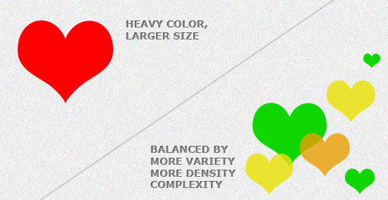
|
|
|
4. White Space

|
|
|

|
|
|
5. Rule of Thirds
6. Golden Ratio
PRACTICAL:
PROJECT 1- COLLAGE EXERCISES
COLLAGE EXERCISE 1 - PHYSICAL
Step 1 & Step 2 - Gathering Materials & Compiling Interesting Graphics
First off, materials such as magazines, newspapers, receipts, card stock, butter paper with pencil sketchings as well my cuttings from a previous design module were obtained from my house.

|
| Fig XX Printed Materials, Week 2 (6/4/22) |
|
|
Step 3 - Pre-Composition 1
After I completed my first composition in class, I wasn't very pleased with the outcome. It lacked movement and was also too neat for my liking. I hated that it resembles my character of being uptight and unable to let things flow naturally.

|
|
|
Step 4 - Feedback From Lecturer & Peers
Feedback from Mr. Martin- he agrees that it was too neat and I needed to mess it up more. On the other hand, he did mention that the sense of perspective from the buildings shot from opposite directions was impressive. After that, what he did next shocked me. Without prior warning, he reached for my work and jumble everything. I let out a loud, "Noooooo!!" but the damage was done. However, I think that instead of destroying my artwork, he made it better. His actions have allowed me to loosen up and also perceive a much more dynamic composition which I appreciate.
Step 5 - 10 reference collage pictures from Pinterest
After completing our first pre-composition, Mr.Martin has advised us to take a breather from collaging & instead begin searching for physical collage samples from Pinterest. That way, we could get a fresh perspective on how to create a more different and eccentric composition. We would also be able to train the eye at differentiating a good design from a bad one.
.png)
|
| Fig XX My Inspiration Board On Pinterest, Week 2 (7/4/22) |
|
|
I was especially drawn to this particular collage due to the way a clock is used as a replacement for a human's head. The symbolic nature of this piece of work could be interpreted in many ways but I believe it is more of the man in the tux being a well-known timekeeper who enjoys observing his surroundings without uttering a single word.

|
| Fig XX “Caos” Vintage Collage Art By Alessandro Pasquinucci, Week 2 (7/4/22) |
Since I possess cut-outs of many buildings shot from a different perspective, I could use this design as a reference for my next composition. The pink circle behind the monochromatic elements provides visual interest and also weightage to the work. Even though the design almost seems unbalanced due to the graphics mostly positioned on the left side of the canvas but the striking pink circle and the green strips equalize the scale. I also very much enjoy the use of contrasting colors in this art piece hence, would also like to carry forward this idea to my next composition.
|
|
|
|
Fig XX Collage Art From Pinterest, Week 2 (7/4/22) |
Step 6 - Finding an interesting background canvas
Since I thought that maybe the background canvas from my first pre-composition was too plain and unappealing, I took out some wrapping papers and colorful card stock & thought to use that instead. To my dismay, my idea was a flop because the patterns and the loud colors were too distracting and diverted the attention away from the main focus which is the collage itself. So, I just revert back to my original canvas which was just a plain A4 paper with a slight yellow tint. On a brighter note, the average-looking background serves a good purpose in my composition as it gives my design the white space it needs to create a visual hierarchy.
.jpeg)
|
|
Fig XX Variety of Wrapping Papers, Week 2 (10/4/22) |

|
|
Fig XX Variety of Colourful Card Stock, Week 2 (10/4/22) |
Step 7 - Finding more graphics such as text
After my first pre-composition & reviewing my peer's work, I realized that I might have neglected the thought of cutting out a few printed text. They help pull the entire composition together as a whole. Therefore, I went and cut out a bolded and capital-lettered heading that says "STORM WARNING" and added that to my collage design.
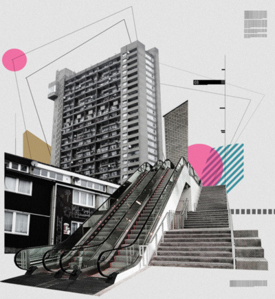
Step 8 - Pre-Composition 2

|
|
Fig XX Pre-Composition 2, Week 2 (10/4/22) |
Step 9 - Pre-Composition 3
Using similar statement graphics, I have created a third composition. Unlike the second composition, I wanted to retrace my steps & try to refine my idea from the very first composition. As seen in Fig XX & Fig XX, the yellow fields, monochrome building, red bus, hands, and lastly, Jack Ma's head were items used for both works. The main difference between the two compositions was the level of compactness when placing each element. In Pre-Composition 3, the elements were very close in proximity, and very minimal space to breathe. Compared to my other try-outs, Fig XX was the most crammed collage due to the increased number of graphical elements, making it look rather cluttered.
.jpeg)
|
|
Fig XX Pre-Composition 3, Week 2 (10/4/22) |
Step 10 - Choosing the best composition out of 3 options.
All of the compositions have unique traits. Although the first pre-composition was not as interesting as the next two designs, it has provided a solid foundation for me to proceed confidently on my next endeavor. Even without being aware, the second composition had a theme. For context, the majority of the elements were cool shades such as black, grey & blue. One of the reasons why this composition worked together so well was due to the usage of complementary colors such as blue and orange. Last but not least, the third composition is a rendition of the first design with additional elements such as the text and different shapes such as the two circles. But overall, I would go for collage design number 2 because it depicts my interest in everything historical.
FINAL SUBMISSION OF PHYSICAL COLLAGE

|
|
Fig XX Final Submission of Physical Collage, JPEG, Week
2 (10/4/22)
|


Comments
Post a Comment